
|
|
|
|
GOLF |
|
||
The Seven
Basic Tools of Quality is a
designation given to a fixed set of graphical techniques identified as being
most helpful in troubleshooting issues related to quality. They
are called basic because they are suitable for people
with little formal training in statistics and because they can be used to solve
the vast majority of quality-related issues.
The seven tools are:
�
Cause-and-effect diagram (also known as the
"fishbone" or Ishikawa diagram)
�
�
Stratification (alternately, flow chart or run chart)
The designation arose in postwar Japan,
inspired by the seven famous weapons of Benkei. It
was possibly introduced by Kaoru Ishikawa who in turn was influenced by a series
of lectures W. Edwards
Deming had given to
Japanese engineers and scientists in 1950. At
that time, companies that had set about training their workforces in statistical
quality control found
that the complexity of the subject intimidated the vast majority of their
workers and scaled back training to focus primarily on simpler methods which
suffice for most quality-related issues.[8]
The Seven Basic Tools stand in contrast to more
advanced statistical methods such as survey sampling, acceptance sampling, statistical hypothesis testing, design of experiments, multivariate analysis, and various methods
developed in the field of operations research.

|
Cause-and-effect diagram |
|
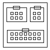
Check sheet |
|
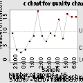
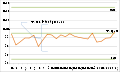
Control chart |
|
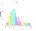
Histogram |
|
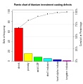
Pareto chart |
|
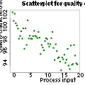
Scatter diagram |
|
Run chart |
he Seven
Management and Planning Tools have
their roots in Operations Research work done after World War II and the Japanese Total Quality Control (TQC) research.
In 1979 the book Seven New Quality Tools for
Managers and Staff was
published and was translated into English in 1983.
|
Affinity
diagrams are a special kind of brainstorming tool that organize large amounts of
disorganized data and information into groupings based on natural
relationships. It was created in the 1960s by the Japanese
anthropologist Jiro Kawakita. Its also known as KJ diagram,after Jiro
Kawakita.When to Use an Affinity Diagram 1)When you are confronted with many
facts or ideas in apparent chaos 2)When issues seem too large and complex to
grasp |

|
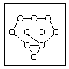
This tool displays all the interrelated cause-and-effect relationships and factors involved in a complex problem and describes desired outcomes. The process of creating an interrelationship digraph helps a group analyze the natural links between different aspects of a complex situation. |
|
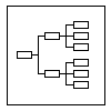
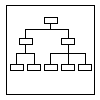
This tool is used to break down broad
categories into finer and finer levels of detail. It can map levels of
details of tasks that are required to accomplish a goal or solution or task.
Developing the tree
diagram helps
one move their thinking from generalities to specifics.
|
|
This tool is used to prioritize items and describe them in terms of weighted criteria. It uses a combination of tree and matrix diagramming techniques to do a pair-wise evaluation of items and to narrow down options to the most desired or most effective. Popular applications for the Prioritization Matrix include Return-on-Investment (ROI) or Cost-Benefit analysis (Investment vs. Return), Time management Matrix (Urgency vs. Importance), etc. |

|
This tool shows the relationship between items. At each intersection a relationship is either absent or present. It then gives information about the relationship, such as its strength, the roles played by various individuals or measurements. Six differently shaped matrices are possible: L, T, Y, X, C, R and roof-shaped, depending on how many groups must be compared. |
|
A useful way of planning is to break down tasks into a hierarchy, using a tree diagram. The PDPC extends the tree diagram a couple of levels to identify risks and countermeasures for the bottom level tasks. Different shaped boxes are used to highlight risks and identify possible countermeasures (often shown as 'clouds' to indicate their uncertain nature). The PDPC is similar to the Failure Modes and Effects Analysis (FMEA) in that both identify risks, consequences of failure, and contingency actions; the FMEA also rates relative risk levels for each potential failure point. |
|
This tool is used to plan the appropriate sequence or schedule for a set of tasks and related subtasks. It is used when subtasks must occur in parallel. The diagram enables one to determine the critical path (longest sequence of tasks). (See also PERT diagram.) |
